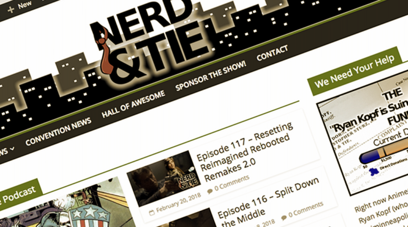
We Redesigned Nerd & Tie!
With the changes at Nerd & Tie and our refocus on original content (and away from the Mega-Blog), the old site was… not exactly working out. I mean, it was a good layout for what we were doing from 2014-2017, but not for our current focus.
With that in mind, we’ve reorganized the site’s layout for 2018. There are a few things you may notice:
- A focus on our original content, like the podcast
- Highlighting some of our other shows
- It loads a heck of a lot faster
That last one was the primary reason we did this. The old site was taking a good thirty seconds to load on high speed connections, and it just wasn’t acceptable.
So yeah — nothing too drastic, and everything you’ve looked for here can still be found. It just won’t take forever to get it anymore.


I like the faster load – it is notable, but is there a link that lets me scroll through all of the articles that I’m not finding? I hate the “Top stories” formats that force me down rabbit holes to find content instead of clicking on one thing to hit it. (I usually only browse websites every few weeks so i usually have a lot to catch up on)
Well we’re kind of purposefully dropping the amount of “junk content” we were putting out — mostly just focusing on our podcasts and shows, while still providing in depth convention articles when big news hits. So the site will now only update one to three times a week.
The menu up top has a link to he Convention news section which you can still page through easily though, and the show pages have links to their archives if you’re looking for anything older.
(So, in other words, the “top content” will be our only content for a while)