DC Entertainment Reveals New Logo, Ditches Terrible 2012 Design
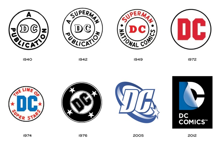
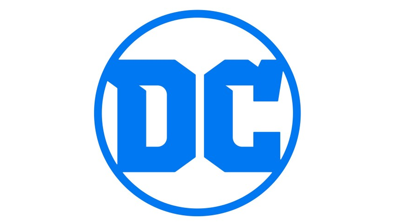
Back in 2012, DC Entertainment (née DC Comics) revealed a new logo… which was just plain terrible. Thankfully, it appears that someone at DC came to their senses, as earlier today they replaced the awful “page turn” logo with something new.
Well, something new that looks kind of old.
The new logo brings DC back to its roots, with a few minor tweaks. While the version that it took inspiration from isn’t my favorite version (that’d be the 1976 iteration), it at least feels like the DC brand that we all grew up with.


The logo is meant to coincide with their “Rebirth” event, and will be seen in print next week with “DC Universe: Rebirth Special #1.” They’re also immediately making the change on all their websites and apps.
And I, for one, think it’s a damned good change.
